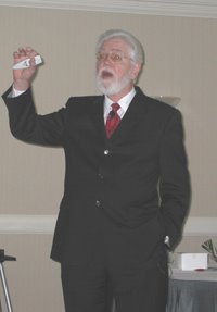
By Jody Shee, secretary, Kansas City Chapter, ASBPE
In the editorial list of things to do, title-, blurb- and caption-writing often are at the bottom of the list. And that’s a shame since titles and captions are read five times m
 ore than body copy, says Don Ranly, professor emeritus at the University of Missouri School of Journalism, Columbia, MO.
“We write these at the last minute, and they often don’t get the time. These are the most important aspects of our publications if we really care about readers and getting our publications read,” he says. Ranly spoke at the workshop session “Writing Brighter Headlines and Captions” at the Kansas City ASBPE annual Magazine Boot Camp held jointly with the Missouri Association of Publications Oct. 19 at the Wyndham Hotel.
Titles
Don’t be afraid to write creative and clever headlines. They can even be a bit cryptic if you include a blurb or deck underneath that summarizes the article content, Ranly says.
Experiment with rhyming, alliteration, allusion, allegory and metaphor in writing titles for articles or ads. “Play with the readers. Award their intelligence. Make their day,” he says, adding, “We should have a title party. Bounce ideas off the wall.”
Ranly pointed out creative headlines from articles and ads:
- “Say yes and know” (An AARP ad)
- “It’s a lot of pun: How to throw your wit around on campus” (college newspaper article)
- “Waking up to down: Tips on buying and caring for down comforters”
- “Jim Salter battles plaque buildup” (an article about a man who wins a lot of awards)
- “Close encounter” (an interview with actress Glenn Close)
- “Lost innocents: It’s the babies that are dead and babies that did it” (about school shootings)
- “Make womb for baby” (about infertility)
- “The customers always write” (title for letters to the editor page)
- “Getting a charge out of credit”
- “Don’t call us… We’ll sue you” (about telemarketing)
- “McDonald’s takes quarter pounding”
Blurbs
Blurbs come in two different types. External blurbs serve as a summary and can appear on the table of contents, while internal blurbs break up copy and draw the reader into the story.
Internal blurbs also give copy-heavy pages a visual break. However, designers shouldn’t run the blurb across the entire page, Ranly says, adding a few other blurb guidelines:
- Write blurbs in sentences using periods.
- Be consistent. If you have more than one internal blurb, either make them all sentences or make them all fragments.
- Keep them short and avoid hyphenations.
- Using pull quotes is fine, especially for internal quotes. Attribute them with a dash. Use single quote marks.
Captions
It’s important to make sure photo captions say something the photo does not say. Give useful information, which means you must demand more information from photographers.
“Every picture needs a caption, and you should write captions as if no one is going to read the copy,” Ranly says, adding several additional guidelines for caption writing:
- Write sentences. Occasionally a fragment will do.
- Use transitive verbs in the active voice and present tense.
- Make captions a minimum of two lines, optimum three lines and maximum four lines.
- Write the most complete captions under the largest or dominant photo.
- Place the captions under the photos.
- Use legible type, preferably bold face, sans serif, at least 10 point.
- Give simple, consistent directions. “From left” works fine, written out and without adding, “to right.”
- Have fun. Bright and entertaining captions communicate better.
- More from the 2006 ASBPE/MAP Boot Camp
- Boot Camp Success
- More to come...
- More ASBPE meeting recaps


No comments:
Post a Comment